Some rooms feel balanced before you can explain why. The walls are quiet enough to hold the furniture. The sofa introduces a second note. Then one smaller color appears in a lamp, a cushion or a piece of art and suddenly the whole room feels intentional.
- What is the 60-30-10 rule in interior design?
- The 60 percent creates the atmosphere
- The 30 percent stops the room from going flat
- The final 10 percent is where the room wakes up
- What does 60-30-10 look like in a real living room?
- A neutral 60-30-10 palette can still feel layered
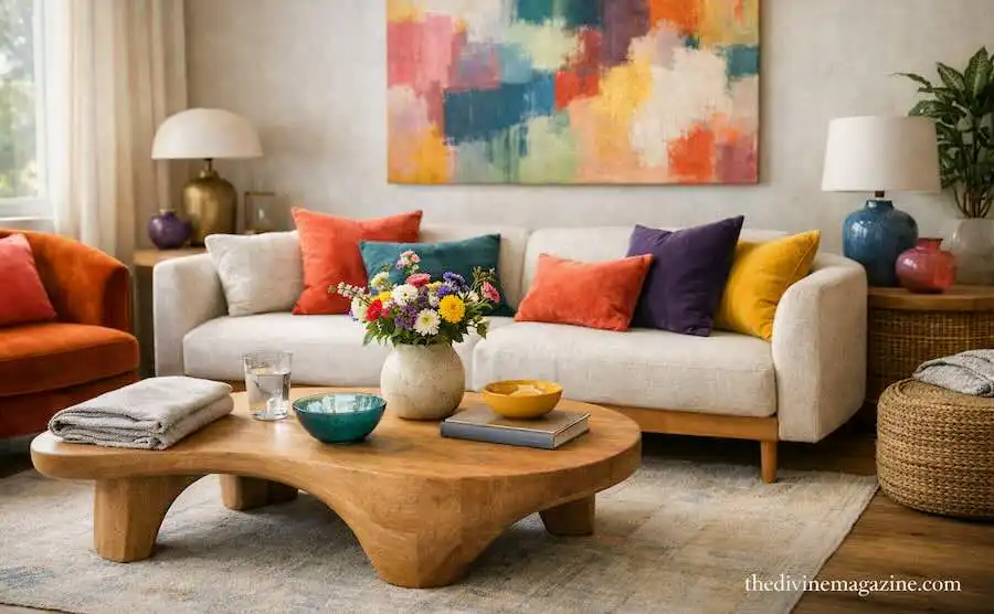
- You can also use the rule with bold color
- How to choose your three colors
- The easiest formulas to copy
- Do materials count as part of the percentage?
- What if your room already has more than three colors?
- When the 60-30-10 rule makes a room look too designed
- When to break the 60-30-10 rule
- The 30-second test before buying another color
- The practical takeaway
- Conclusion
- Frequently Asked Questions
- What is the 60-30-10 rule in decorating?
- What should be the 60 percent in a room?
- What counts as the 30 percent?
- What should the 10 percent accent color be?
- Do the percentages need to be exact?
- Can I use more than three colors?
- The part of the 60-30-10 rule most people miss
- Try the grayscale test
- The 10 percent does not need to be one exact color
- The secret fourth ingredient is not another color
- Use the 10 percent as your seasonal layer
- Watch: the 60-30-10 rule explained visually
- A second video reveals why the rule works beyond interiors
- The Divine version: 60-30-10-0
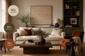
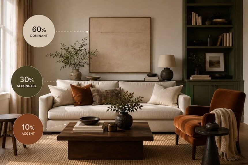
That balance is often described through the 60-30-10 decorating rule: roughly 60 percent dominant color, 30 percent secondary color and 10 percent accent. It is one of interior design’s simplest frameworks, and it is still being recommended by designers in 2026 because it makes color decisions easier without requiring a room to look formulaic.
The useful part is not the arithmetic. It is the hierarchy.
What is the 60-30-10 rule in interior design?
The rule divides a room’s color palette into three visual layers:
- 60 percent: the dominant color that establishes the room.
- 30 percent: a secondary color that adds depth and contrast.
- 10 percent: an accent color used for smaller, higher-impact moments.
Designers commonly apply the 60 percent to larger surfaces such as walls, flooring, cabinetry or large furniture; the 30 percent to upholstery, curtains, accent chairs or built-ins; and the 10 percent to art, cushions, lamps and smaller decorative objects.
Think of it less as three buckets of paint and more as three levels of visual volume.
The 60 percent creates the atmosphere
The dominant color is what someone should feel before they start noticing individual objects.
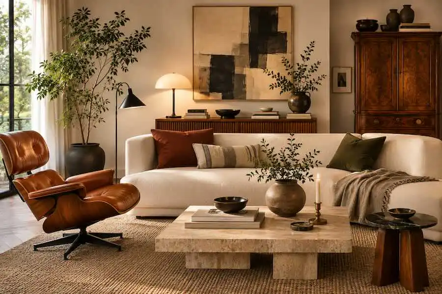
In a calm living room, that might be warm white across the walls and a large cream sofa. In a moodier room, it could be olive walls with tonal cabinetry. In a bedroom, soft blue walls and bedding might carry most of the visual field.
The 60 percent does not have to be neutral. Current design guidance still uses the rule with saturated palettes, including cool colors balanced by warmer secondary tones.
What matters is dominance. One color needs to establish the background against which everything else is read.
The 30 percent stops the room from going flat
The secondary color does the structural work of contrast.
Suppose the room begins with warm white walls and a cream rug. The 30 percent might arrive through a tobacco-brown sofa, walnut curtains or deep green cabinetry. It should feel clearly different from the dominant color without competing for control.
This is often the easiest place to introduce a richer tone because furniture and textiles naturally occupy enough surface area to make the color feel deliberate.
If the 60 percent is cool, designers sometimes use the 30 percent to bring warmth back into the scheme — for example, blue with rust, green with camel or purple with mustard.
The final 10 percent is where the room wakes up
The accent color is small in quantity and large in consequence.
A red lamp on a pale console. Mustard cushions against a navy chair. Cobalt glass on a walnut shelf. Black picture frames in an otherwise soft room.
Because the accent appears against larger areas of quieter color, even a small amount can carry considerable visual weight. Recent 2026 guidance from HGTV still describes the 10 percent as the part that gives a palette energy and focus rather than simply filling leftover space.
This is why buying six unrelated accent colors rarely produces the same effect. The eye needs repetition.
What does 60-30-10 look like in a real living room?
Imagine a living room built around warm ivory, walnut and muted rust.
- 60% ivory: walls, rug and the largest sofa.
- 30% walnut and brown: coffee table, curtains, lounge chair and storage furniture.
- 10% rust: cushions, artwork details and one ceramic lamp.
The room reads as light and calm from the doorway. Brown gives it depth. Rust gives it a pulse.
The proportions do not need to be literally measured. If the rust lamp is unusually large or glossy, it may already carry more than its nominal 10 percent in visual weight.
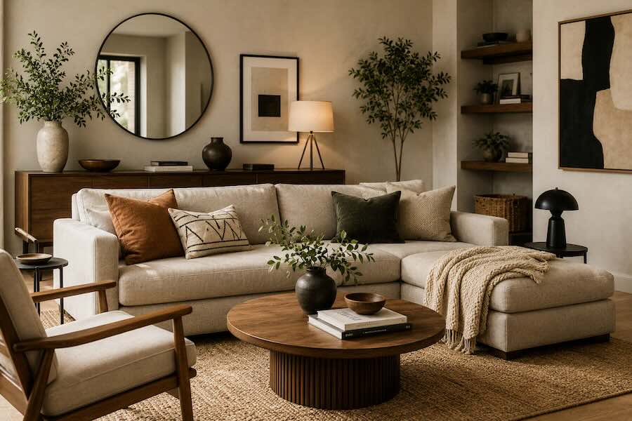
A neutral 60-30-10 palette can still feel layered
The rule does not require three obvious colors.
A monochromatic room can use warm white as the 60 percent, taupe or grey as the 30 percent and black as the 10 percent. Homes & Gardens specifically notes that the framework can work in monochrome schemes, where difference comes through tone rather than dramatic hue changes.
Texture becomes especially important here. Bouclé, oak, linen, wool, matte ceramics and brushed metal can stop a neutral palette from feeling flat even when the colors stay close together.
You can also use the rule with bold color
A bold room becomes easier to control when one color is still given authority.
Picture deep blue walls as the 60 percent, a burnt-orange sofa and curtains as the 30 percent, then small hits of yellow through lighting and artwork as the 10 percent.
The colors are energetic, but the hierarchy keeps them from shouting at the same volume.
Architectural Digest has also discussed using the 60-30-10 framework with analogous color schemes, where neighboring colors on the color wheel create a softer, more harmonious result.
How to choose your three colors
Do not begin with paint chips unless the room is completely empty.
Start with the thing you already love most.
It might be a vintage rug, artwork, sofa fabric or stone countertop. Pull the dominant, secondary and accent tones from that object. Designers often build palettes from an existing textile or piece with several colors already working together because the relationships feel more natural than choosing three disconnected shades separately.
A faded rug containing cream, olive and brick red has already done part of the work for you.
The easiest formulas to copy
Warm minimal
60%: warm white
30%: natural oak or camel
10%: black
Modern earthy
60%: soft beige
30%: olive green
10%: rust
Moody blue
60%: muted blue
30%: warm brown
10%: ochre
Soft contemporary
60%: cream
30%: taupe
10%: burgundy
Do materials count as part of the percentage?
Yes, visually they often do.
A walnut table reads as brown. Stainless steel often reads as silver-grey. Natural rattan can function as warm tan. Black-framed windows can become part of the accent layer even though they are architectural rather than decorative.
This is why the rule works best when you look at the room as an image rather than separating paint, furniture and materials into different categories.
What if your room already has more than three colors?
That is normal.
The 60-30-10 rule is not a ban on every fourth color. It is a way to establish a dominant palette.
Homes & Gardens explicitly notes that designers often introduce an additional small accent once the core balance is working.
The trick is keeping those extra colors subordinate. A tiny pink detail inside artwork does not suddenly create a fourth major color story.
If several extra colors begin appearing across furniture, walls and textiles, however, the hierarchy starts to dissolve.
When the 60-30-10 rule makes a room look too designed
Any decorating rule becomes visible when followed too literally.
Three cushions in exactly the same accent color. Curtains perfectly matching the chair. Artwork purchased solely because it contains the correct shade. Suddenly the room looks coordinated rather than collected.
Use variations within each color family instead. The 30 percent might contain walnut, tobacco and caramel rather than one identical brown. The 10 percent might move from deep oxblood to softer rust.
That tonal variation keeps the structure while removing the showroom effect.
When to break the 60-30-10 rule
Break it when the room becomes more interesting without it.
Maximalist interiors, color-drenched rooms and highly collected spaces often work through repetition, pattern and material rather than a neat three-color hierarchy. Current design commentary is increasingly comfortable with abandoning rigid color rules when a stronger concept holds the room together.
You might use 60-20-10-10. Or 50-30-20. Or cover the room almost entirely in one color and let texture do the contrast.
The original rule has already done its job if it taught you to ask which color should dominate, which should support and which should surprise.
The 30-second test before buying another color
Stand in the doorway and look at the whole room rather than the object you are considering adding.
- What color do you notice first? That should usually be the 60 percent.
- What color gives the room depth? That is probably your 30 percent.
- Where does your eye land last? A successful 10 percent often appears there.
If you cannot identify any hierarchy, another color probably will not solve the problem.
The practical takeaway
Choose one dominant color to establish the room, a secondary color to create depth and one smaller accent to give the composition energy.
Apply the broadest color to the largest surfaces. Let the 30 percent appear through furniture and textiles. Save the accent for fewer, stronger moments.
Then stop calculating.
The 60-30-10 rule is successful when nobody notices you used it.
Conclusion
A beautiful room rarely needs more decisions. It usually needs clearer ones.
One color creates the atmosphere. Another gives it weight. A third catches the light from across the room.
Sixty. Thirty. Ten.
Not mathematics. Rhythm.
Frequently Asked Questions
What is the 60-30-10 rule in decorating?
The 60-30-10 rule is a color-balancing framework in which roughly 60 percent of a room uses a dominant color, 30 percent uses a secondary color and 10 percent uses an accent color.
What should be the 60 percent in a room?
The 60 percent usually appears across the largest visual surfaces, such as walls, flooring, cabinetry or large furniture. It should establish the room’s dominant color impression.
What counts as the 30 percent?
The secondary 30 percent commonly appears through sofas, curtains, accent chairs, rugs, built-ins or other medium-scale elements that add contrast without overtaking the dominant color.
What should the 10 percent accent color be?
The accent should create a small point of energy or contrast. It can appear through cushions, lamps, artwork, ceramics, flowers or decorative objects.
Do the percentages need to be exact?
No. Designers generally use the rule as a visual guideline rather than measuring literal percentages. Color intensity, scale, pattern and reflectivity all affect how much visual weight an element carries.
Can I use more than three colors?
Yes. Additional colors can work when the dominant three-color hierarchy remains clear. Small extra accents are easier to integrate than introducing several equally strong competing colors.
The part of the 60-30-10 rule most people miss
Here is where we would take the rule one step further.
The percentages are usually explained as if they describe physical surface area. That is useful for beginners, but it is not quite how a finished room is perceived. What matters is perceptual weight. A small cobalt lamp can attract more attention than a much larger beige sofa because saturation, contrast, darkness, gloss and placement all change how strongly a color registers.
That is why current explanations of the rule increasingly emphasize visual proportion rather than literal square footage. Even a room that technically measures 60-30-10 can feel wrong when its accent is exceptionally saturated or its secondary color has much stronger contrast than the dominant field.
For Divine, we use a more useful working model:
Divine’s visual-weight test: size × saturation × contrast × repetition.
This is not a scientific equation or an established industry formula. It is our editorial shorthand for diagnosing a room. The larger, brighter, darker, more contrasting or more frequently repeated a color becomes, the more of the composition it appears to occupy.
So if your 10 percent starts shouting, do not immediately add more of the other colors. First reduce its visual weight.
Try the grayscale test
There is a remarkably simple way to catch a palette that looks balanced on a paint card but chaotic in a room: photograph it with your phone and temporarily view the image in grayscale.
Color disappears, leaving differences in lightness, darkness, scale and contrast much easier to see. If every major object suddenly appears equally heavy, the problem may not be the colors themselves. The room may lack visual hierarchy.
Turn the color back on and look again. Your 10 percent should usually behave like punctuation rather than another paragraph.
The 10 percent does not need to be one exact color
This is another place where literal interpretations make rooms look staged.
If burgundy is the accent, you do not need a burgundy cushion, burgundy vase, burgundy candle and burgundy lampshade in precisely the same shade. Treat the 10 percent as a color family.
Oxblood can sit beside rust. Olive can move toward moss. Ochre can fade into tobacco. Recent 2026 design guidance similarly recommends varying tones within each portion rather than repeating identical shades throughout a room.
The repetition remains visible, but it stops looking purchased as a set.
The secret fourth ingredient is not another color
There is technically something missing from 60 + 30 + 10: light.
The same palette can look restrained at 9 a.m. and dramatically more saturated after sunset. Warm artificial light changes how surfaces relate to one another. Glossy finishes catch highlights. Dark corners make secondary colors appear heavier. North-facing daylight and direct afternoon sun can make the same paint behave like two different materials.
That is why we would never approve a 60-30-10 palette from screenshots or online swatches alone. Test the dominant and secondary colors together in the actual room, then look at them in morning daylight, afternoon light and after the lamps come on.
The ratio may stay the same. The room will not.
Use the 10 percent as your seasonal layer
There is also a practical reason to keep the strongest accent small: it becomes the cheapest part of the room to change.
Keep the 60 percent relatively durable. Let the 30 percent carry furniture and textiles you expect to live with for years. Then allow the final 10 percent to move.
Terracotta and tobacco can warm the room in fall. Deep red can take over in winter. A muted green or dusty blue can appear in spring without repainting a wall or replacing a sofa.
That turns 60-30-10 from a decorating formula into a purchasing strategy: spend longest-term money on the 60, carefully on the 30 and experiment with the 10.
Watch: the 60-30-10 rule explained visually
Interior designer Melissa Welsh of Welsh Design Studio gives a clear visual explanation of how the dominant, secondary and accent proportions work across an actual room. It is particularly useful after reading the examples above because you can see how furniture, walls and accessories contribute different amounts of color.
There is an interesting detail worth noticing while watching: the rule is easier to understand in a complete room than through isolated color swatches. That is because materials, furniture scale and visual weight become part of the calculation.
A second video reveals why the rule works beyond interiors
For readers interested in the design logic underneath the formula, designer Jesse Showalter demonstrates the same 60-30-10 principle in digital interface design. The medium is different, but the lesson is surprisingly useful for interiors: dominant surfaces create calm, secondary color establishes structure and a small accent directs attention.
That crossover is revealing. The formula is not really about sofas or paint. It is about preventing several visual elements from competing for attention simultaneously.
The Divine version: 60-30-10-0
We would add one final number to the rule: zero.
Zero is the part of the room you deliberately leave alone.
An empty section of wall beside the artwork. A coffee table without six decorative objects. Space around the accent chair. A shelf containing three objects instead of thirteen.
Negative space does not have a percentage because it is not another color. Yet it determines whether the existing colors have enough room to register. This becomes particularly important when the 10 percent contains a saturated shade, pattern or reflective material.
Sixty establishes. Thirty supports. Ten interrupts. Zero lets you see all three.
Your tailored reading list
More stories chosen for their mood, aesthetic and point of view.