






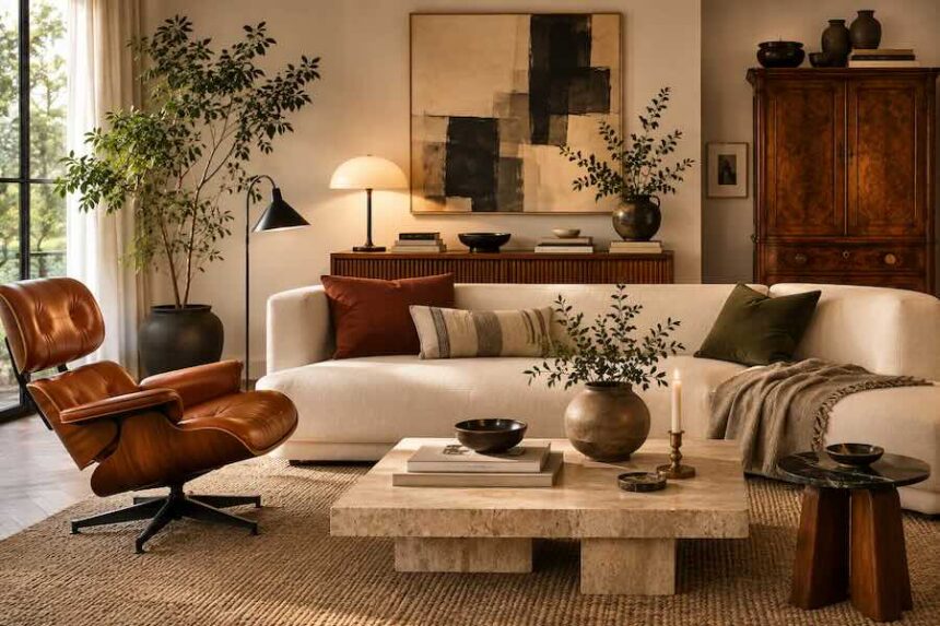
A room can hold a chrome lamp from 2026, a walnut cabinet from the 1960s and an inherited armchair without looking confused. The problem begins when every object tries to explain a different aesthetic at the same volume.
- What is the 70-30 rule in interior design?
- Why mixing styles often goes wrong
- Start by choosing your 70 percent
- Use the 30 percent where people will notice it
- What does the 70-30 rule look like in a real room?
- 70% Scandinavian + 30% vintage
- 70% contemporary + 30% traditional
- 70% mid-century modern + 30% industrial
- Modern + vintage: probably the easiest 70-30 combination
- Scandinavian + industrial: soften the hard edges
- Traditional + contemporary: the 2026 mix to know
- Color is the bridge between different styles
- Texture can do the same job
- Pay attention to visual weight, not just percentages
- Do not confuse the 70-30 rule with the 60-30-10 color rule
- The mistake: adding a third, fourth and fifth style
- How to use the 70-30 rule in a living room
- How to use it in a bedroom
- Before buying anything, remove something
- The practical takeaway
- Conclusion
- Frequently Asked Questions
That is where the 70-30 rule becomes useful. Instead of asking whether modern and vintage, Scandinavian and industrial, or traditional and contemporary pieces are technically allowed to coexist, it gives one style visual control and lets another interrupt it.
The result should not look calculated. Done well, you never see the percentage. You simply notice that the room feels collected rather than matched.
What is the 70-30 rule in interior design?
The basic idea is straightforward: approximately 70 percent of a room follows one dominant or anchor style, while the remaining 30 percent introduces a contrasting style. The principle has been combining different aesthetics without losing cohesion.
That 70 percent establishes the visual language. It might be warm minimalism, mid-century modern, traditional, industrial or Scandinavian. The remaining 30 percent creates friction through furniture, lighting, art, textiles or objects from another design vocabulary.
Importantly, this is not a measuring exercise. You do not need seven Scandinavian objects for every three vintage ones. The ratio describes visual dominance, not inventory.
Interior designers quoted by Homes & Gardens have similarly described the 70-30 split as a starting point rather than something that needs to be followed mathematically.
Why mixing styles often goes wrong
Imagine a living room with a boucle sofa, Victorian side table, industrial shelving, Moroccan rug, farmhouse console, chrome floor lamp and coastal accessories.
Individually, nothing is necessarily wrong. Together, there may be no hierarchy.
Our eyes look for relationships: repeated colors, similar proportions, recurring materials and recognizable shapes. When every piece introduces another visual language, those relationships become harder to find. The room begins to feel less layered and more accidental.
The 70-30 rule solves this by making one aesthetic responsible for the architecture of the room while the second provides contrast.
Start by choosing your 70 percent
The dominant style should usually appear in the largest visual elements.
- Walls and architectural finishes
- Sofa or bed
- Large storage furniture
- Dining table
- Rugs
- Curtains
- Major lighting
Suppose you want a predominantly Scandinavian living room. Pale walls, a restrained sofa, oak furniture and simple linen curtains could establish the 70 percent before anything contrasting enters the space.
Now the room has grammar.
The remaining pieces can bend it.
Use the 30 percent where people will notice it
The smaller percentage should not mean insignificant.
In fact, contrast often carries greater visual weight than its physical footprint suggests. A sculptural vintage chair can command more attention than a much larger neutral sofa. A polished chrome lamp can interrupt a room filled with old wood. One ornate gilt mirror can change an otherwise minimal wall.
That makes the 30 percent an ideal place for personality.
Try an antique side table beside a contemporary sofa. Place a modern abstract painting above a traditional console. Introduce stainless steel into a room dominated by oak and linen. Put a severe modern lamp on a deeply traditional desk.
The contrast should be visible. Otherwise there is little reason to mix styles in the first place.
What does the 70-30 rule look like in a real room?
The easiest way to understand the 70-30 rule is to stop thinking in percentages and start thinking in rooms. The dominant style should establish the atmosphere from the doorway. The secondary style should become more noticeable as you look closer.
70% Scandinavian + 30% vintage
Build the room around a cream sofa, pale oak, linen curtains and a simple wool rug. Then interrupt that calm with a 1970s lounge chair, darker wooden side table and one old ceramic lamp. Keep the palette connected so the vintage pieces add age rather than visual noise.
70% contemporary + 30% traditional
Start with clean upholstery, restrained lighting and simple architectural lines. Add an antique chest, framed oil painting and a traditional patterned rug. The older pieces should feel deliberately chosen rather than scattered throughout every corner.
70% mid-century modern + 30% industrial
Let walnut furniture, low silhouettes and warm upholstery establish the room. Bring in industrial contrast through a steel shelving unit, black metal lighting or a sharper glass-and-metal table. Because dark metal carries considerable visual weight, a few pieces can be enough.
In each case, the formula is the same: one style creates the room; the other stops it from becoming predictable.
Modern + vintage: probably the easiest 70-30 combination
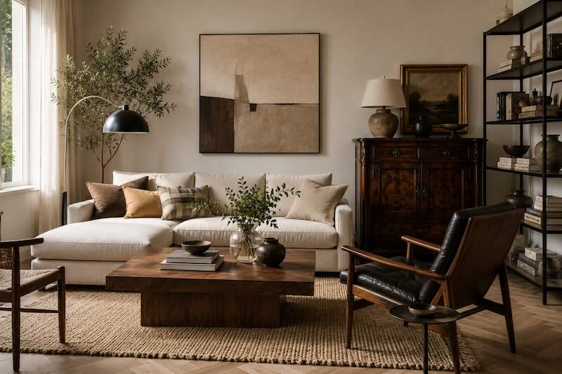
A contemporary room is often an ideal canvas for vintage furniture because the architecture around an older object gives it breathing space.
Start with clean upholstery, simple window treatments and restrained contemporary furniture. Then introduce an old wooden cabinet, vintage lounge chair, ceramic lamp or weathered side table.
The age becomes visible precisely because everything surrounding it is quieter.
This approach also avoids one of the problems with buying an entire room from a single collection: nothing appears to have existed before anything else.
Layering contemporary furniture with mid-century and vintage pieces is a technique designers use to create interiors that feel more established over time. The same principle sits comfortably inside the 70-30 framework.
Scandinavian + industrial: soften the hard edges
This pairing works because the materials already understand each other.
A Scandinavian base might contain pale timber, wool, linen and uncomplicated furniture silhouettes. Industrial elements introduce blackened steel, brushed metal, exposed hardware or sharper geometry.
Keep the room predominantly soft and natural, then let metal provide the 30 percent.
A black steel shelving unit. Chrome lighting. A metal-framed coffee table.
You need surprisingly little. Against pale wood and quiet textiles, metal has considerable visual weight.
Traditional + contemporary: the 2026 mix to know
The broader design conversation in 2026 is increasingly comfortable with interiors that cross periods rather than reproduce one style perfectly. Contemporary interpretations of transitional design are leaning into deliberate tension between old and new rather than trying to make the distinction disappear.
That makes traditional plus contemporary particularly useful.
Picture plaster mouldings, warm timber floors and an antique chest forming the historical base. Now add a low contemporary sofa, one oversized abstract artwork and a sharply geometric lamp.
Or reverse it. Keep a modern architectural shell and introduce an old farmhouse table, framed oil painting and worn leather chair.
Either direction works. What matters is deciding which era gets the louder voice.
Color is the bridge between different styles
Two objects from completely different periods can suddenly make sense together when they share color.
A burgundy contemporary chair can speak to the faded red inside an antique rug. Black window frames can connect with a vintage black lacquer table. Warm cream upholstery can pull the pale tones from an old landscape painting.
This is one of the most dependable ways to make mixed interiors feel intentional. Architectural Digest similarly recommends establishing color relationships when combining disparate patterns, while designers mixing furniture from different decades often use color, texture or shape as the common element.
The objects do not have to match. They simply need something to talk about.
Texture can do the same job
When color feels too obvious, repeat texture instead.
Rough timber can connect a rustic table to contemporary oak cabinetry. A wool rug can soften both a modern steel chair and an antique wooden desk. Linen curtains can create calm around furniture from several decades.
Material repetition creates rhythm. The eye encounters something familiar before meeting the next contrast.
This is particularly useful in neutral rooms, where differences in texture become more visible because color is not doing all the work.
Pay attention to visual weight, not just percentages
This is the part of the 70-30 rule that matters most.
Not every object occupies the same amount of visual space. Dark colors, strong patterns, oversized forms and reflective surfaces can feel heavier than pale, simple objects around them.
A 2026 discussion of visual weight in interior design highlighted the importance of balancing visually heavier furniture against lighter elements. That principle explains why mechanically counting objects rarely produces a convincing 70-30 room.
One enormous antique armoire might already provide most of the traditional tension a minimal bedroom needs. Three more antique pieces could tip the balance completely.
Stand in the doorway and look at the room as a composition rather than a catalogue.
Do not confuse the 70-30 rule with the 60-30-10 color rule
The names sound similar, but they solve different decorating problems.
The 70-30 rule discussed here is primarily a way of thinking about the balance between two styles or design directions.
The familiar 60-30-10 rule divides a color palette into roughly 60 percent dominant color, 30 percent secondary color and 10 percent accent. There is also a 70-20-10 variation used for color.
None needs to become arithmetic. Even designers who use these frameworks tend to treat them as guardrails rather than laws. Recent design commentary has increasingly emphasized breaking rigid color formulas when the room benefits from a more intuitive approach.
The mistake: adding a third, fourth and fifth style
This is how a room starts losing its centre.
You begin with Scandinavian and vintage. Then a glamorous brass table appears. Then an industrial lamp. Then a coastal basket. Then a farmhouse bench.
Eventually, every individual purchase may be attractive while the room itself says nothing clearly.
If you want to introduce a third influence, make it subtle and connect it strongly through color or material. Do not give three styles equal authority unless eclecticism itself is the intention and you are comfortable managing considerably more visual complexity.
How to use the 70-30 rule in a living room
Imagine a warm contemporary living room as the 70 percent.
- A simple cream sofa establishes the main silhouette.
- Warm white walls keep the architectural background quiet.
- An oak coffee table and wool rug repeat natural texture.
- Plain curtains maintain the contemporary base.
Now introduce vintage as the 30 percent.
- A 1970s lounge chair adds a different silhouette.
- An old ceramic table lamp introduces age and irregularity.
- A framed vintage artwork interrupts the clean wall.
- A small inherited side table adds darker wood.
The room remains contemporary when seen from the doorway. Up close, it begins telling a more complicated story.
How to use it in a bedroom
Bedrooms usually benefit from an even quieter interpretation.
Let the 70 percent come from the bed, walls, rug and window treatments. Then concentrate the contrasting style around one or two areas: bedside tables, lighting, artwork or a chair.
A minimal bedroom with linen bedding can handle ornate antique nightstands beautifully. A traditional bedroom can feel sharper with contemporary sconces and one large abstract canvas.
You do not need contrast everywhere. Repetition makes the exception more powerful.
Before buying anything, remove something
A mixed-style room often looks messy because it contains too many objects, not because the styles themselves are incompatible.
Clear a side table. Remove the decorative object that does not connect to anything else. Give the vintage chair six inches more air. Leave part of the wall blank.
Negative space gives contrasting pieces boundaries. Without it, different styles collapse into one another and the eye loses the ability to read them individually.
A collected room still needs silence.
The practical takeaway
When mixing two interior styles, decide which one you want someone to notice first. Make that your 70 percent.
Use the larger furniture, architecture and broad surfaces to establish it. Introduce the second style through fewer, stronger pieces. Then connect both sides through repeated color, material, shape or texture.
Finally, step back. If the room feels evenly divided, remove or replace something from the secondary style. If it feels flat, give the 30 percent one stronger moment.
The goal is not 70-30 accuracy. It is hierarchy.
Conclusion
The most convincing homes rarely belong perfectly to one decade, catalogue or design movement. They contain the new sofa and the old table. Smooth steel beside worn timber. Something inherited beside something ordered last Tuesday.
The 70-30 rule simply gives those differences structure.
Let one style build the room. Let the other make it interesting.
Frequently Asked Questions
What is the 70-30 rule in interior design?
The 70-30 rule suggests using one dominant interior style for roughly 70 percent of a room and a contrasting style for the remaining 30 percent. It is a loose visual framework rather than a mathematical requirement.
Can you mix two interior design styles?
Yes. Giving one style visual dominance and using the second for contrast can make different aesthetics feel intentional. Repeating colors, materials, textures or shapes across both styles helps connect them.
How do you mix modern and vintage furniture?
Start with a clear dominant style and introduce a smaller number of pieces from the other period. For example, a predominantly contemporary room might use a vintage lounge chair, side table and artwork as contrasting elements.
Is the 70-30 rule the same as the 60-30-10 rule?
No. The 70-30 rule can be used to balance two decorating styles, while the 60-30-10 rule is commonly used to organize a three-color palette into dominant, secondary and accent proportions.
How many interior styles can you mix in one room?
Two styles are usually the easiest to control. A third influence can work when it is subtle and shares colors, materials or forms with the existing scheme. Giving several unrelated styles equal visual weight is more likely to make a room feel fragmented.
Why does my mixed-style room look cluttered?
The problem may be visual weight rather than incompatible styles. Too many statement pieces, competing colors or decorative objects can remove hierarchy. Editing accessories and introducing more negative space can make the same furniture feel considerably calmer.