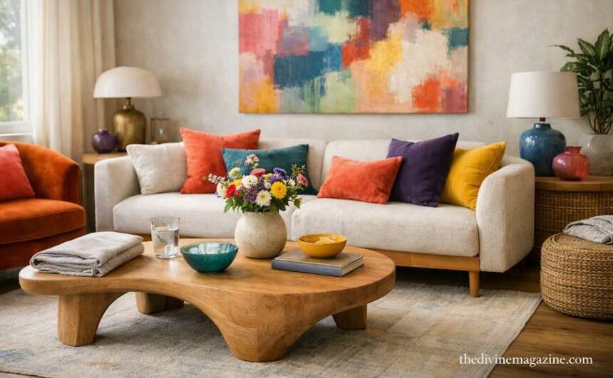
A teal wall behind a warm wood console. A Single burgundy armchair in an otherwise quiet room. The eye lands somewhere first, then settles. That’s what color is supposed to do in a living room — give the space a pulse, not overwhelm it.
Neutral rooms had their decade. What’s replacing them isn’t chaos — it’s confidence. deeper, richer color used with intention, in rooms designed to be lived in rather than photographed once and forgotten.
Color is back, and it’s bolder than the last time
Designers are moving past the beige-and-grey era in a real way. A diverse range of paint colors is now defining living room design, with nature-inspired shades like sage and terracotta sitting alongside deep blues, charcoals, and aubergine for real depth and character. The shift is deliberate — rooms are turning moodier because people want spaces with personality, not just a safe backdrop (AOL / Real Simple).
In practice, that means fewer accent walls and more full commitment — an entire room in one confident color, or a ceiling that finally gets some attention.
teal is the color doing the most work right now
If sage green is the safe, quietly popular choice for 2026 living rooms, teal is its bolder sibling. It manages to feel calming and bold at the same time, reading as more current than a straightforward dark green (Homes & Gardens). Against warm wood furniture and earthy decor, a rich blue-green wall wraps a room in depth without tipping into cold.
It’s also forgiving. Teal pairs cleanly with the warm neutrals already living in most rooms — cream, tan, unfinished wood — so it rarely requires starting over.
Ceilings are the new accent wall
Accent walls are quietly retiring. In their place: color capping and color drenching, techniques that carry a wall’s color up onto the ceiling or wrap an entire room in one shade for a more architectural, cohesive look (Hunker). Benjamin Moore’s Helen Shaw notes that carrying color onto trim and architectural details highlights cornices and picture rails in older properties, while in newer, more minimalist spaces it gives clean surfaces a richer, more dynamic quality (Hunker).
A painted ceiling sounds like a bigger commitment than it is. Done in a room with decent light, it reads as intentional rather than accidental — the room feels finished, not mid-project.
jewel tones for the truly committed
For anyone ready to go further than a wall, jewel tones — sapphire, emerald, deep burgundy — are the living room’s answer to statement dressing. They show up on cabinetry now too, not just walls, with blues, reds, ochre, and green cropping up on built-ins and furniture pieces as a way to introduce bold color without repainting a whole room (Yahoo / House Digest).
A single piece of jewel-toned furniture does more for a room than four smaller colorful accessories combined. It gives the eye one clear place to land.
Playful is having a real moment
Not every colorful room needs to be moody. Pinterest’s trend data points to a rise in what it calls the “FunHaus” aesthetic — striped elements, playful art, a nostalgic, carnival-adjacent energy that’s the opposite of quiet luxury (AOL / House Digest). It’s the loudest end of the colorful spectrum, and it isn’t for every room. But even a small dose — a striped lampshade, one genuinely playful print — signals that a room doesn’t take itself too seriously.
How to bring color in without regretting it
- Start with one wall, not four. A single teal or olive wall gives you the full effect with an easy exit if you change your mind.
- Anchor color with warm wood. Bold shades read as sophisticated, not chaotic, when they’re grounded by natural wood tones and warm neutrals.
- Try the ceiling before the whole room. Color capping gives a dramatic result without repainting every surface.
- Let one piece of furniture carry the color. A jewel-toned armchair or cabinet does more than five small colorful accessories.
- Keep the rest of the room quiet. Bold color needs negative space around it — a busy room with bold color everywhere loses the whole effect.
Where this leaves you
Color in 2026 isn’t about covering every surface — it’s about choosing where the room gets to speak. One wall, one chair, one ceiling. The rest stays quiet so that choice actually means something. That restraint is what separates a colorful room from a chaotic one, and it’s the part worth remembering before the paint goes on.
FAQ
What’s the easiest bold color to start with if I’ve never used one before?
Teal or olive green. Both read as bold without feeling as committed as something like burgundy or navy, and both pair easily with the warm neutrals most people already own.
Are accent walls out of style now?
They’re fading in favor of color capping and full color-drenching, which read as more intentional. A single accent wall isn’t wrong, just less current than it was a few years ago.
How do I add color without repainting anything?
Furniture and cabinetry. A single jewel-toned chair, cabinet, or bookcase brings the same visual impact as a painted wall, with none of the commitment.
Will a colorful living room feel dated quickly?
Less than a highly specific trend color would. Earthy, nature-inspired shades like sage, olive, and terracotta are framed by designers as versatile enough to hold up past a single season, unlike a very saturated, of-the-moment hue.
What keeps a bold room from feeling overwhelming?
Restraint everywhere else. One bold element — a wall, a ceiling, one piece of furniture — needs quiet surroundings to actually register as a choice rather than clutter.
2 views